PORA is a chain of foods shops that makes delicious food. Burgers, hamburgers, fries are food that improves mood and gives taste pleasure.
ПОРА це мережа foods shops, яка виготовляє смачну їжу. Бургери, гамбургери, фрі це їжа яка покращує настрій і дарує смакову насолоду.


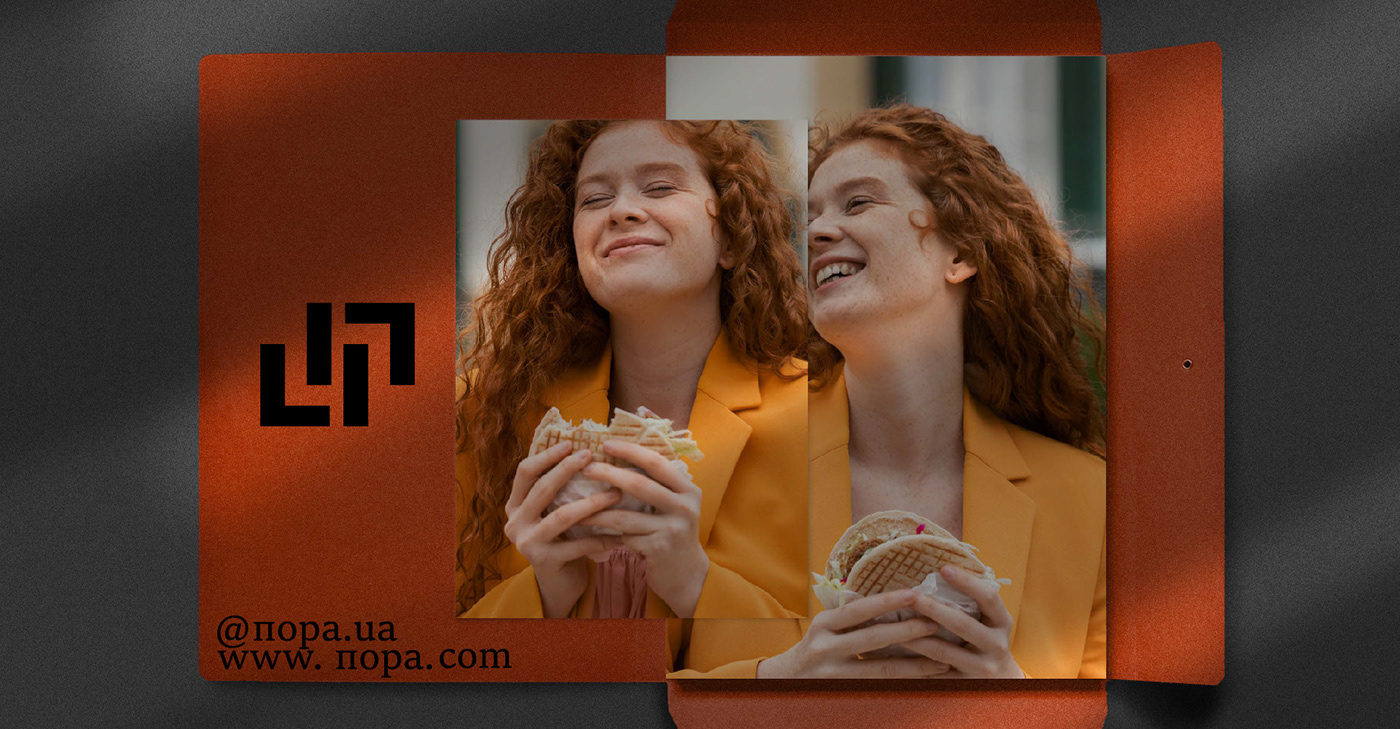
The logo is made of straight lines and immediately prompts passers-by to think it's time to eat. Also, the logo features rounded shapes that reflect the shape of burgers and thereby subconsciously encourage visitors to taste these delicacies.
The basis of corporate style is simplicity, strictness and memorability. An illustration that lifts the spirits of customers has also been developed. The illustration is also done in a restrained style with notes of fun and pleasure.
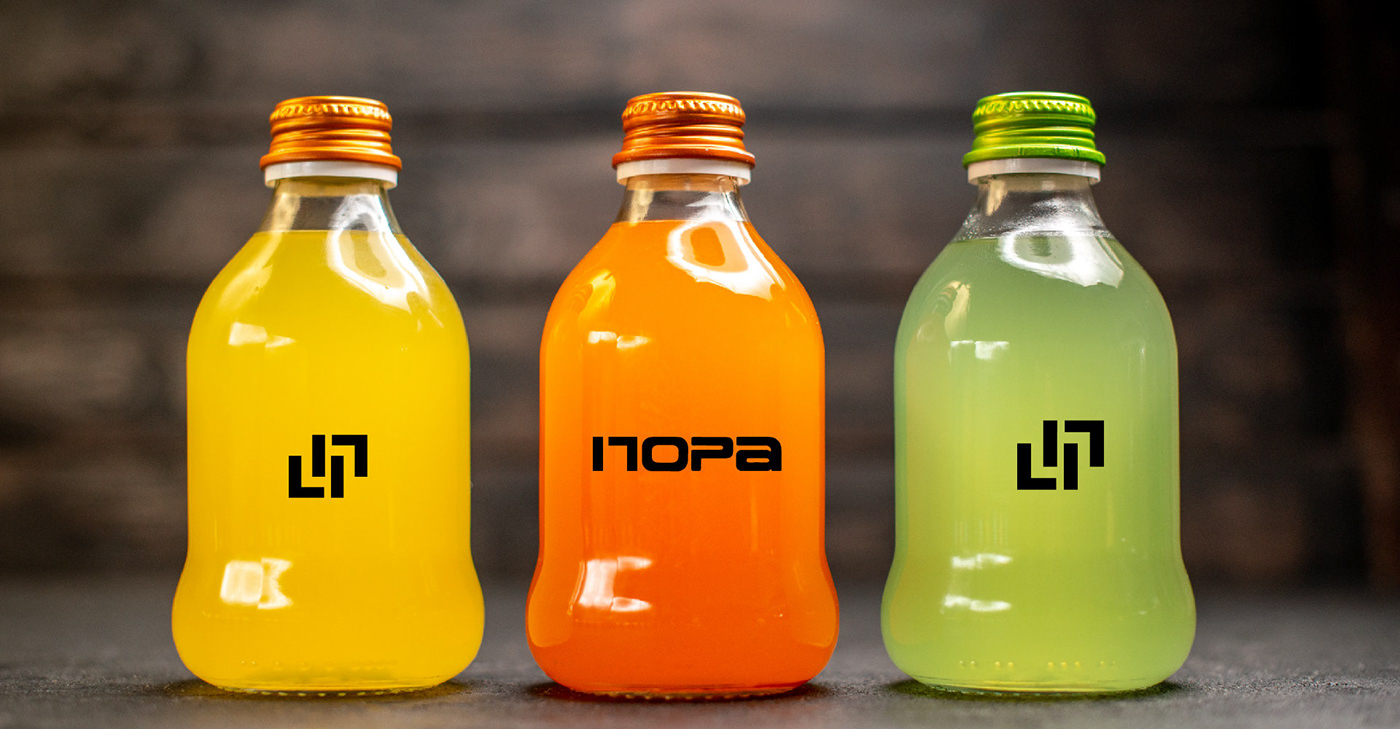
Orange color forms the basis of corporate style. The color is youthful, modern, which best reflects the target audience of the brand. The color scheme stimulates the appetite, provides an opportunity for relaxation and pleasure from eating delicious food.
The basis of corporate style is simplicity, strictness and memorability. An illustration that lifts the spirits of customers has also been developed. The illustration is also done in a restrained style with notes of fun and pleasure.
Orange color forms the basis of corporate style. The color is youthful, modern, which best reflects the target audience of the brand. The color scheme stimulates the appetite, provides an opportunity for relaxation and pleasure from eating delicious food.
Логотип виконаний із прямих ліній і спонукає прохожих відразу на думку пора поїсти. Також у логотипі присутні заокруглені форми які відображають форму бургерів і тим самим підсвідомо заохочують відвідувачів скуштувати ці смаколики.
Основою фірмового стилю є простота, строгість і запамʼятовуваність. Розроблена також ілюстрація, яка піднімає настрій клієнтів. Ілюстрація виконана також у стриманому стилі з нотками веселощів та задоволення.
Помаранчевий колір складає основу фірмового стилю. Колір молодіжний, сучасний який найкраще відображає цільову аудиторію бренду. Кольорова гамма стимулює апетит, надає можливість для відпочинку і задоволення від споживання смачної їжі.